Why are users on your site?
- To look around?
- To do or achieve something?
I pondered this question after reading Gerry McGovern’s discussion on Impatient vs Bored. He suggests that people using (or rather choosing ‘not’ to use) websites are actually more likely to be impatient than just bored with your content.
I think we need to explore the different types of sites and people visiting them to understand this a bit more.
Different types of sites
IT people have traditionally used the rather woolly terms of Web Site and Web Application to differentiate between something simple and something more sophisticated. There’s no official classification here. There’s usually some characteristics that point more to one than the other.
Characteristics of a Web Application
- Dynamic content. This could be driven from a database or external source
- User interaction. Users can register/update information, upload, download. They can ‘do’ useful things on the site.
- Commerce. Users can buy things
Users and Visitors
People accessing the web can also be classified.
You could say that a visitor is
“someone who has a passing interest in your site, looking to find some information or browsing around for comparison purposes.”
A user is
“someone with a longer term association or affiliation who potentially logs into the site, or gains knowledge of the structure and becomes expert in achieving their tasks.”
It’s reasonable to assume that users are subset of visitors. Visitors and users will also access both types of sites. This means that whether someone is a visitor or a user depends on the specific context of their goal at the time of access, and their past history on the site. (phew – almost drew a venn diagram there!).
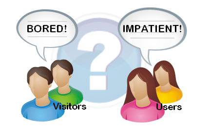
Impatient and Bored
Impatience is something more likely to be experienced by a user who’s trying to complete a meaningful task – i.e. they have a certain expectation of how a site will work and perform. Casual browsers are more likely to switch off from the site if they don’t like what they see.
If you want a huge generalisation then:
“Users with an affiliation to a site (web application) are likely to become impatient if their progress is impeded, and casual visitors to a site (web application or content site) are more likely to become bored if the content is not engaging or visually appealing.”
Underlying Factors
There’s a couple of factors that underpin all types of web access:
- Information Architecture (IA) – the structure of the information, sections and pages on the site.
- Usability – the ease with which people can achieve their goals on the site.
IA is equally important to simple and sophisticated sites, as a visitor to a company brochure site needs to know that they can get around speedily and find what they’re looking for without undue delay. Bad IA on a larger site is likely to grate with users over time and people will find themselves frustrated because their navigation around the site isn’t logical.
A good and logical IA is often a matter of being consistent with de facto standards. For example many web users now have subconscious expectactions that company sites have ‘Contact Us’, ‘About Us’ etc. Going against the grain here leads to impatience.
Usability is the detail in every interaction. The sections and pages on the site may be completely logical, but if the developers have produced a whizz-bang Flash product catalogue widget that takes over a minute to load, then you’ll be getting some impatient users. The effect will be similar if the flow of a page or workflow tries to go against simple and accepted interface design principles. This could include using non-standard form elements on a page, or collecting information in a strange order just because it suits a back-end system (but not the user).
Functionality vs Visual Design
For the most part, functionality wins over visual eye candy with users. Business users routinely put up with desktop applications that do what they need without swooping curves, dripping in glass buttons and subtle gradients. There is however a growing expectation of a minimum level of visual design on the web. Maybe this makes up for the fact that sites still rarely deliver everything a user wants.
The Pressure to Redesign
Creative agencies will often suggest a site’s poor performance is down to the visual design not being up to scratch – as they want to perform that job. This takes advantage of the (still) general lack of understanding about the web amongst company decision-makers. This surprisingly includes a lot of marketing departments who still only think ‘print’.
The other extreme is marketers on a constant rebranding trip, constantly quoting ‘market risks’, effectively keeping themselves gainfully employed.
The model of development on the web over the years has been largely evolutionary, with change coming without warning, and largely without consultation with users. This was OK in previous times (I refuse to say web 1.0), when user expectations were low, and the level of engagement with any one site was also low. This is still true for many small sites.
The price of Success
With community sites becoming more mainstream and popular, companies now often elicit feedback to work out where to go next. Sometimes when big changes are made (Facebook) with little or no communication, things can get a little heated with petitions and protests galore.
Just imagine if Microsoft significantly changed the interface to Word on the millions of computers around the world without notice. It just wouldn’t happen!
Sites like Facebook have learned the hard way that success on the web also breeds greater responsibility to change with regards to your users. Users of free services can simply vote with their feet, and increasingly do. Facebook has flooded the social web space and so hangs on to many users as they’ve become the de facto standard.
Very few sites can rely on such a situation.
Managing Change
So how can you manage change on websites? When do you need a lick of paint, and when do you need a complete redesign?
The following isn’t an exhaustive list, but gives some thoughts on some tools and approaches to consider.
Understand your user base.
Use web stats tools like Google Analytics to understand where your users come from and where they go on the site. Set up goals to see how successful things like your payment workflow is – i.e. what percentage of people add something to a cart, and subsequently complete the transaction?
Analyse the paths into your site so see if there’s any opportunities for SEO improvement, like better keywording, extra landing pages etc.
Make the right changes
Sometimes it’s appropriate to do some field research to work out the right changes to make on the site. This could be from a variety of sources. The key is to remain light-footed throughout the process so you can react to changes as they (inevitably) occur:
- Business Requirements. This is typically what drives most change, but internal people are not the only people in the equation. They don’t use the site the way external users do.
- Usability testing with the current site and a group of users can be quite revealing to find gaps that explain poorly performing site areas, and also give rise to new ideas.
- User surveys can be effective, but asking questions of users needs to be offered sparingly, and in an optional way. Keep things small and succinct to get the best return of ‘take home’ points. Consider offering some reward for completing the survey.
Design it right and Try before you Buy
In order to react to change, and feedback you need to get people looking at your intended changes as quickly as possible. The following is an example of an iterative approach from detailed design to implementation for a complex change that will affect a large number of users:
WireFrame
Wireframe development is a great place to start by designing layout and visualising key elements and interactions on the site. This is specifically tackled before any detailed visual design to test the concepts with business people and prospective users.
Prototype
This can be created from the wireframes to put some more meat around the concept built in the wireframes. This could be as simple as page images with hyperlinks to allow clicking through the flow, to a slim ‘actual’ prototype in place on the site. You’d typically build a ‘proper’ prototype if you’ve got some technical risk to overcome – e.g. proving a technical solution is possible for a given situation. Some tools like Axure exist to facilitate wireframes and prototypes in one.
Prototype testing
This is then performed either with a control group of users, and or with business users to assess the viability of the solution and also to get valuable feedback and other ideas.
The wireframes and prototype would then be updated again with further rounds of testing as required to get to a point where things are formalised enough to start development.
Visual design may also creep into this area, as some people simply can’t say ‘yes’ until they see ‘exactly’ how something’s going to look, but try and limit this. This is where you hope for a programmer who’s design-savvy.
This phase ends with the wireframes being signed off by the business.
Visual design
This will no doubt continue to evolve as it’s the tangible stuff that businesses can ‘feel’, but should be tied down as early as possible. The business should sign off completed mockups (e.g. from Photoshop), based on the approved wireframes.
Completing the Job
The rest of the job is standard develop/test/implement etc, but developing small chunks and testing early, and implementing often is always a good way to go.
If the original prototype was actually ‘functional’, then you might be able to go fairly quickly to some internal or public A:B testing and with a bit of work you could find yourself finished.
Whether you’re catering more for visitors or users, the first step to any change is putting yourself in their shoes.